How to create a transparent triangle with border using CSS?
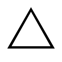
How can I create the following shape with CSS?
I tried this to be a solution:
 .triangle:after {
        position:absolute;
        content:"";
        width: 0;
        height: 0;
        margin-top:1px;
        margin-left:2px;
        border-left: 10px solid transparent;
        border-right: 10px solid transparent;
        border-bottom: 10px solid white;
    }

    .triangle:before {
        position:absolute;
        content:"";
        width: 0;
        height: 0;
        border-left: 12px solid transparent;
        border-right: 12px solid transparent;
        border-bottom: 12px solid black;
    }
You can see it working at Triangle. This is working, but with a trick of borders. Is there another way it could be done?
Using SVG vectors this can be done easily, but I don't want to go that lengthy way.
Solution 1:
I've found a webkit-only solution, using the ▲ character:
.triangle {
  -webkit-text-stroke: 12px black;
  color: transparent;
  font-size: 200px;
}
<div class="triangle">▲</div>Extras:
-
CanIUse reference for
text-stroke- all major browsers covered as of 2019 - CSS-tricks article
- Useful HTML shapes
Solution 2:
CSS-border version:
.triangle {
    position: relative;
    width:0;
    border-bottom:solid 50px black;
    border-right:solid 30px transparent;
    border-left:solid 30px transparent;
}
.triangle .empty {
    position: absolute;
    top:9px;
    left:-21px;
    width:0;
    border-bottom:solid 36px white;
    border-right:solid 21px transparent;
    border-left:solid 21px transparent;
}
Adding a white triangle inside the black one: http://jsfiddle.net/samliew/Hcfsx/
Solution 3:
Here is an idea using multiple background and linear-gradient:
.triangle {
  width:100px;
  height:100px;

  background:
    /* Left side */
    linear-gradient(to bottom left,
      transparent 49.5%,#000 50% calc(50% + 10px),
      transparent calc(50% + 11px)) right/50% 100%,
    /* right side */
    linear-gradient(to bottom right,
      transparent 49.5%,#000 50% calc(50% + 10px),
      transparent calc(50% + 11px)) left/50% 100%,
    /* bottom side*/
    linear-gradient(#000,#000) bottom/calc(100% - 20px) 10px;
  background-repeat:no-repeat;
}
<div class="triangle"></div>You can consider CSS variables to easily adjust the shape:
.triangle {
  --t:10px;  /* Thickness */
  --c:black; /* Color */

  width:100px;
  height:100px;
  display:inline-block;

  background:
    /* Left side */
    linear-gradient(to bottom left,
      transparent 49.5%,var(--c) 50% calc(50% + var(--t)),
      transparent calc(50% + var(--t) + 1px)) right/50% 100%,
    /* right side */
    linear-gradient(to bottom right,
      transparent 49.5%,var(--c) 50% calc(50% + var(--t)),
      transparent calc(50% + var(--t) + 1px)) left/50% 100%,
    /* bottom side*/
    linear-gradient(var(--c),var(--c)) bottom/calc(100% - 2*var(--t)) var(--t);
  background-repeat:no-repeat;
}

body {
 background:pink;
}
<div class="triangle"></div>
<div class="triangle" style="--t:5px;--c:blue;width:150px"></div>
<div class="triangle" style="--t:8px;--c:red;height:150px"></div>
<div class="triangle" style="--t:15px;--c:green;width:80px"></div>
A different syntax with less gradient:
.triangle {
  --t:10px;  /* Thickness */
  --c:black; /* Color */

  width:100px;
  height:100px;
  display:inline-block;
  border:var(--t) solid transparent;
  border-bottom-color:var(--c);
  background:
    /* Left side */
    linear-gradient(to bottom left,
      transparent 49.5%,var(--c) 50% calc(50% + var(--t)),
      transparent calc(50% + var(--t) + 1px)) right,
    /* right side */
    linear-gradient(to bottom right,
      transparent 49.5%,var(--c) 50% calc(50% + var(--t)),
      transparent calc(50% + var(--t) + 1px)) left;
  background-size:50% 100%;
  background-origin:border-box;
  background-repeat:no-repeat;
}

body {
 background:pink;
}
<div class="triangle"></div>
<div class="triangle" style="--t:5px;--c:blue;width:150px"></div>
<div class="triangle" style="--t:8px;--c:red;height:150px"></div>
<div class="triangle" style="--t:15px;--c:green;width:80px"></div>You can consider the same idea to create a rectangle triangle:
.triangle {
  --t:10;  /* Thickness */
  --c:black; /* Color */

  width:100px;
  height:100px;
  display:inline-block;
  border:calc(var(--t)*1px) solid transparent;
  border-image:
    linear-gradient(to bottom left,
      transparent 49.5%,var(--c) 50%) var(--t);
  background:
    /* Left side */
    linear-gradient(to bottom left,
      transparent 49.5%,var(--c) 50% calc(50% + var(--t)*1px),
      transparent calc(50% + var(--t)*1px + 1px));
  background-origin:border-box;
  background-repeat:no-repeat;
}

body {
 background:pink;
}
<div class="triangle"></div>
<div class="triangle" style="--t:5;--c:blue;width:150px"></div>
<div class="triangle" style="--t:8;--c:red;height:150px"></div>
<div class="triangle" style="--t:15;--c:green;width:80px"></div>
If you want an equilateral triangle simply keep a ratio bettween the width/height using the initial code
.triangle {
  --t:10px;  /* Thickness */
  --c:black; /* Color */

  width:100px;
  display:inline-block;
  border:var(--t) solid transparent;
  border-bottom-color:var(--c);
  background:
    /* Left side */
    linear-gradient(to bottom left,
      transparent 49.5%,var(--c) 50% calc(50% + var(--t)),
      transparent calc(50% + var(--t) + 1px)) right,
    /* right side */
    linear-gradient(to bottom right,
      transparent 49.5%,var(--c) 50% calc(50% + var(--t)),
      transparent calc(50% + var(--t) + 1px)) left;
  background-size:50% 100%;
  background-origin:border-box;
  background-repeat:no-repeat;
}

.triangle:before {
  content:"";
  display:block;
  padding-top:86.6%;
}

body {
 background:pink;
}
<div class="triangle"></div>
<div class="triangle" style="--t:5px;--c:blue;width:150px"></div>
<div class="triangle" style="--t:8px;--c:red;width:50px"></div>
<div class="triangle" style="--t:15px;--c:green;width:80px"></div>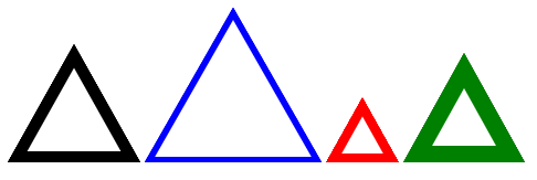
Related answer for more details about the calculation: How do CSS triangles work?
Solution 4:
Try using SVG
<svg xmlns="http://www.w3.org/2000/svg" version="1.1">
  <polygon points="200,10 250,190 160,210"
  style="fill:lime;stroke:purple;stroke-width:1"/>
</svg>
Here is the tutorial