Transitioning from Windows Forms to WPF
For a long time now, I have been stuck with Windows Forms development (started with VB6, and has continued through to C# .NET 4.5), and I have pretty much hit the limit of what Windows Forms can do, both using pure .NET, and special effects with Native Code.
I have tried to learn WPF and XAML, but I get stuck right at WPF's new designer. It really seems very difficult to use in comparison to the Windows Forms designer.
I want to know if there are any alternatives to .NET's WPF designer, that are more suited to Windows Forms developers?
Solution 1:
I like to blog about beginner articles for WPF, and there are a few in particular that may help you out:
- Understanding the change in mindset when switching from WinForms to WPF
- What is this "DataContext" you speak of?
- A Simple MVVM Example
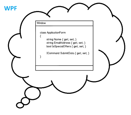
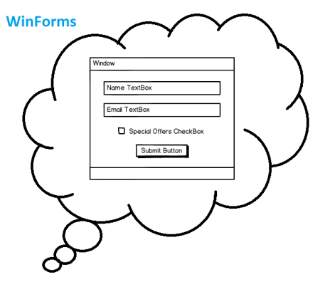
To summarize, the biggest difference between Winforms and WPF is that in WPF your data layer (the DataContext) is your application, while in Winforms your UI layer is your application.
To look at it another way, with WPF your application consists of the objects you create, and you use Templates and other UI objects to tell WPF how to draw your application components.

That's the opposite of WinForms where you build your application out of UI objects, and then supply them with the data needed.

Because of this, the designer isn't actually used that much since your application components are designed in code, and the designer is only needed to draw a user-friendly interface that reflects your data classes (typically Models and ViewModels)
And personally, I prefer to type all my XAML out by hand since it's faster and doesn't make as much of a mess as the drag/drop WPF designer does, although I do use the Designer on occasion to preview what my UI will look like.
So to your answer your question about if there's other WPF designers suited for WinForms developers, I would suggest that instead of looking for another designer, instead look to learn how to use WPF in the way it's meant to be used. Using WPF like it's WinForms means you miss out on much of what makes it so great :)
Solution 2:
Well although, some people don't agree, I would also recomment to not use the VS designer. At least not to create an interface. If you may want to get a first impression of your implementation without starting the application, it's a good viewer at least as long no sophisticated things like Styles and Templates are used. But, IMHO, its drag and drop result should only be used as prototype and therefore be discarded after it's no longer needed.
Here are some reasons which are important for me not to use it.
The VS designer is working with fix margins and alignments (which is usually not necessary, if you're using the layout controls), means you have to touch many controls, if the requirements are changed. If you're deep in XAML and the WPF mechanics you can create an applications which can be modified with small effort, regarding the look and feel.
Since the designer is generating the xaml, the composition is not optimal and the UI may perform badly. I didn't measure it, it's just a feeling.
A much better alternative is MS Blend, although the start is everything else but easy. Its drag and drop result is much better that the result of the VS designer.
But it's a pretty powerful tool, which helps you to use pretty powerful elements to create a state of the art UI. I recommend to visit at least a short workshop to get an idea of its opportunities.
Back to your question, IMHO, and I think many people agree, get yourself a good book e.g. WPF Unleashed and later, if you want to know more about the details, WPF Pro. There are a lot of features which are different to Winforms. You won't get to know them by using any designer. I think that's the best approach.
Please also consider that there are many frameworks and libraries (e.g. MVVM light, WPFToolkit) out there, which are already solving some common problems. So it's not necessary to reinvent the wheel.
Solution 3:
I know this is an old question but for the benefit of anyone else looking at this, I think I should redress the balance a bit - reading some of the other answers, I get the feeling that some of the 'don't use the designer' sentiment comes from not using it properly. This tutorial is quite good to get you going and answers some of the criticisms in the other posts.
For instance, you can switch from the Winforms-like margin-based layout that is the default when you drop a control, to a more WPF-ish style by right-clicking and selecting 'Reset Layout'
This video covers similar ground.
I still prefer the VS2010 designer on balance - VS2013 seems to be a bit buggy when dragging and dropping onto TabItems **, (which my current project uses a lot) - but the VS2013 Document Outline view lets you move things around in that view too, which can be a real plus.
Really, though, to get the most out of WPF and xaml you need to be reasonably fluent in both the designer view and the xaml view and switching between them; if you shy away from the designer, you are missing out on something that can help you a lot.
** Edit - although this seems to have been improved in Update 3 for VS 2013, and in previews of VS14, to date I still get odd behaviour at times.