Standard Android Button with a different color
I'd like to change the color of a standard Android button slightly in order to better match a client's branding.
The best way I've found to do this so far is to change the Button's drawable to the drawable located in res/drawable/red_button.xml:
<?xml version="1.0" encoding="utf-8"?>
<selector xmlns:android="http://schemas.android.com/apk/res/android">
    <item android:state_pressed="true" android:drawable="@drawable/red_button_pressed" />
    <item android:state_focused="true" android:drawable="@drawable/red_button_focus" />
    <item android:drawable="@drawable/red_button_rest" />
</selector>
But doing that requires that I actually create three different drawables for each button I want to customize (one for the button at rest, one when focused, and one when pressed). That seems more complicated and non-DRY than I need.
All I really want to do is apply some sort of color transform to the button. Is there an easier way to go about changing a button's color than I'm doing?
I discovered that this can all be done in one file fairly easily. Put something like the following code in a file named custom_button.xml and then set background="@drawable/custom_button" in your button view:
<?xml version="1.0" encoding="utf-8"?>
<selector
    xmlns:android="http://schemas.android.com/apk/res/android">

    <item android:state_pressed="true" >
        <shape>
            <gradient
                android:startColor="@color/yellow1"
                android:endColor="@color/yellow2"
                android:angle="270" />
            <stroke
                android:width="3dp"
                android:color="@color/grey05" />
            <corners
                android:radius="3dp" />
            <padding
                android:left="10dp"
                android:top="10dp"
                android:right="10dp"
                android:bottom="10dp" />
        </shape>
    </item>

    <item android:state_focused="true" >
        <shape>
            <gradient
                android:endColor="@color/orange4"
                android:startColor="@color/orange5"
                android:angle="270" />
            <stroke
                android:width="3dp"
                android:color="@color/grey05" />
            <corners
                android:radius="3dp" />
            <padding
                android:left="10dp"
                android:top="10dp"
                android:right="10dp"
                android:bottom="10dp" />
        </shape>
    </item>

    <item>
        <shape>
            <gradient
                android:endColor="@color/blue2"
                android:startColor="@color/blue25"
                android:angle="270" />
            <stroke
                android:width="3dp"
                android:color="@color/grey05" />
            <corners
                android:radius="3dp" />
            <padding
                android:left="10dp"
                android:top="10dp"
                android:right="10dp"
                android:bottom="10dp" />
        </shape>
    </item>
</selector>
Following on from Tomasz's answer, you can also programmatically set the shade of the entire button using the PorterDuff multiply mode. This will change the button colour rather than just the tint.
If you start with a standard grey shaded button:
button.getBackground().setColorFilter(0xFFFF0000, PorterDuff.Mode.MULTIPLY);
will give you a red shaded button,
button.getBackground().setColorFilter(0xFF00FF00, PorterDuff.Mode.MULTIPLY);
will give you a green shaded button etc., where the first value is the colour in hex format.
It works by multiplying the current button colour value by your colour value. I'm sure there's also a lot more you can do with these modes.
Mike, you might be interested in color filters.
An example:
button.getBackground().setColorFilter(new LightingColorFilter(0xFFFFFFFF, 0xFFAA0000));
try this to achieve the color you want.
This is my solution which perfectly works starting from API 15. This solution keeps all default button click effects, like material RippleEffect. I have not tested it on lower APIs, but it should work.
All you need to do, is:
1) Create a style which changes only colorAccent:
<style name="Facebook.Button" parent="ThemeOverlay.AppCompat">
    <item name="colorAccent">@color/com_facebook_blue</item>
</style>
I recommend using
ThemeOverlay.AppCompator your mainAppThemeas parent, to keep the rest of your styles.
2) Add these two lines to your button widget:
style="@style/Widget.AppCompat.Button.Colored"
android:theme="@style/Facebook.Button"
Sometimes your new
colorAccentisn't showing in Android Studio Preview, but when you launch your app on the phone, the color will be changed.
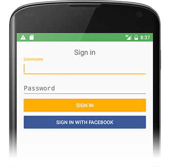
Sample Button widget
<Button
    android:id="@+id/sign_in_with_facebook"
    style="@style/Widget.AppCompat.Button.Colored"
    android:layout_width="match_parent"
    android:layout_height="wrap_content"
    android:layout_gravity="center"
    android:text="@string/sign_in_facebook"
    android:textColor="@android:color/white"
    android:theme="@style/Facebook.Button" />
You can now also use appcompat-v7's AppCompatButton with the backgroundTint attribute:
<android.support.v7.widget.AppCompatButton
    xmlns:app="http://schemas.android.com/apk/res-auto"
    android:layout_width="match_parent"
    android:layout_height="wrap_content"
    app:backgroundTint="#ffaa00"/>