Two-tone background split by diagonal line using css
I am trying to create a background using css where one side is a solid color and the other is a texture: the two are split by a diagonal line. I would like this to be 2 separate divs since I plan to add some motion with jQuery where if you click on the right, the grey triangle gets smaller and if you click on the left the textured triangle gets smaller (like a curtain effect). Any advice would be greatly appreciated.
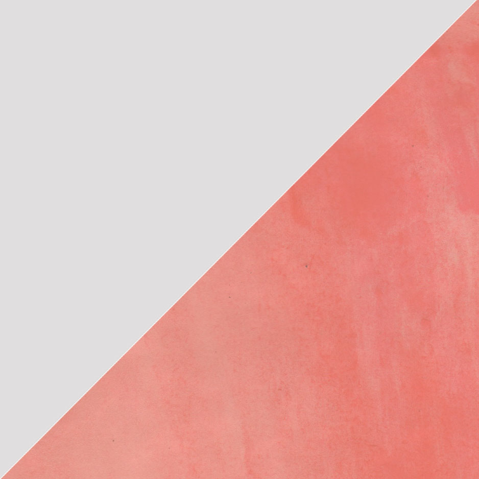
I think using a background gradient with a hard transition is a very clean solution:
.diagonal-split-background{
  background-color: #013A6B;
  background-image: -webkit-linear-gradient(30deg, #013A6B 50%, #004E95 50%);
}
Here are the examples in action: http://jsbin.com/iqemot/1/edit
You can change the placement of the diagonal line with the border pixels. With this approach you would have to position content over the background setup however.
#container {
  height: 100px;
  width: 100px;
  overflow: hidden;
  background-image: url(http://www.webdesign.org/img_articles/14881/site-background-pattern-07.jpg);
}

#triangle-topleft {
  width: 0;
  height: 0;
  border-top: 100px solid gray;
  border-right: 100px solid transparent;
}
<div id="container">
<div id="triangle-topleft"></div>
</div>For this sort of thing you could use pseudo selectors such as :before or :after in your CSS to minimize on unnecessary HTML markup.
HTML:
<div id="container"></div>
CSS:
#container {
    position: relative;
    height: 200px;
    width: 200px;
    overflow: hidden;
    background-color: grey;

}

#container:before {
    content: '';
    position: absolute;
    left: 20%;
    width: 100%;
    height: 200%;
    background-color: rgb(255, 255, 255); /* fallback */
    background-color: rgba(255, 255, 255, 0.5);
    top: 0;
    -webkit-transform: rotate(45deg);
    -moz-transform: rotate(45deg);
    transform: rotate(45deg);
}
JSFiddle
I then attempted to to make it so that each section could expand depending on where you clicked. This unfortunately requires a little extra jQuery as the position of your click (relative to the the box) needs to be worked out.
A class is then added to the box which changes the :before pseudo object. The upside of using a class is that CSS animations are optimized better for the browser than jQuery ones.
JSFiddle
Resources:
Selecting and manipulating CSS pseudo-elements such as ::before and ::after using jQuery
Using jQuery how to get click coordinates on the target element
This method words on different sized windows and fills the screen. Even works on mobile.
<!DOCTYPE html>
<html lang="en">
<head>
    <meta charset="UTF-8">

    <title>Diagonal</title>
    <style>
        *{
            margin: 0;
            padding: 0;
        }

        .diagonalimg{
            width: 100%;
            height: 100vh;
            background-image: linear-gradient(to top left, #e394a3 50%, #8dd6a6 50%);
        }
    </style>
</head>
<body>
    <div class="diagonalimg">

    </div>

</body>
</html>