How can I show only corner borders?
I'm wondering if it's possible in CSS to make a border but only for corner. Something like this:
****                         ****
*                               *
*                               *

             CONTENT

*                               *
*                               *
****                         ****
Assuming <div id="content">CONTENT</div> and that CONTENT includes at least one HTML node.
#content {position:relative}
#content:before, #content:after, #content>:first-child:before, #content>:first-child:after {
    position:absolute; content:' ';
    width:80px; height: 80px;
    border-color:red; /* or whatever colour */
    border-style:solid; /* or whatever style */
}
#content:before {top:0;left:0;border-width: 1px 0 0 1px}
#content:after {top:0;right:0;border-width: 1px 1px 0 0}
#content>:first-child:before {bottom:0;right:0;border-width: 0 1px 1px 0}
#content>:first-child:after {bottom:0;left:0;border-width: 0 0 1px 1px}
Here's a Fiddle
I would use overlapping divs.
One with square corners. And the Other with rounded corner (so it doesn't hide the corners of the first one).
<div id="div1" />
<div id="div2" />


#div1 {
  position:absolute;
  top:9px;
  left:9px;
  height:100px;
  width:100px;
  background-color:white;
  border:1px solid black;
}

#div2 {
  position:relative;
  top:-1px;
  left:-1px;
  height:102px;
  width:102px;
  background-color:white;
  border-radius: 15px;
}
http://jsfiddle.net/y3EfP/
Result:

An enhanced solution provided by @web-tiki:
http://jsfiddle.net/webtiki/y3EfP/147/
You can achieve that using multiple linear gradients as a background image.
div {
  width: 100px;
  height: 100px;

  background:
    linear-gradient(to right, black 4px, transparent 4px) 0 0,
    linear-gradient(to right, black 4px, transparent 4px) 0 100%,
    linear-gradient(to left, black 4px, transparent 4px) 100% 0,
    linear-gradient(to left, black 4px, transparent 4px) 100% 100%,
    linear-gradient(to bottom, black 4px, transparent 4px) 0 0,
    linear-gradient(to bottom, black 4px, transparent 4px) 100% 0,
    linear-gradient(to top, black 4px, transparent 4px) 0 100%,
    linear-gradient(to top, black 4px, transparent 4px) 100% 100%;

  background-repeat: no-repeat;
  background-size: 20px 20px;
}<div></div>SVG
This is another great alternative if you now want to start using vectors to allow for great responsiveness.
<svg viewBox="0 0 100 100" width="50px">
  <path d="M25,2 L2,2 L2,25" fill="none" stroke="black" stroke-width="3" />
  <path d="M2,75 L2,98 L25,98" fill="none" stroke="black" stroke-width="3" />
  <path d="M75,98 L98,98 L98,75" fill="none" stroke="black" stroke-width="3" />
  <path d="M98,25 L98,2 L75,2" fill="none" stroke="black" stroke-width="3" />
</svg>
SVG is a great tool to use. Some of the advantages of using SVG in this case are:
- Curve control
- Fill control (opacity, color)
- Stroke control (width, opacity, color)
- Amount of code
- Time to build and maintain the shape
- Scalable
- No HTTP request (if used inline like in the example)
Browser support for inline SVG goes back to Internet Explorer 9. See canIuse for more information.
Here is an idea using gradient and CSS variables where you can easily control the shape of your border:
.box {
  --b:5px;   /* thickness of the border */
  --c:red;   /* color of the border */
  --w:20px;  /* width of border */


  border:var(--b) solid transparent; /* space for the border */
  --g:#0000 90deg,var(--c) 0;
  background:
    conic-gradient(from 90deg  at top    var(--b) left  var(--b),var(--g)) 0    0,
    conic-gradient(from 180deg at top    var(--b) right var(--b),var(--g)) 100% 0,
    conic-gradient(from 0deg   at bottom var(--b) left  var(--b),var(--g)) 0    100%,
    conic-gradient(from -90deg at bottom var(--b) right var(--b),var(--g)) 100% 100%;
  background-size:var(--w) var(--w);
  background-origin:border-box;
  background-repeat:no-repeat;

  /*Irrelevant code*/
  width:200px;
  height:100px;
  box-sizing:border-box;
  margin:5px;
  display:inline-flex;
  font-size:30px;
  justify-content:center;
  align-items:center;
  line-height:90px;
}
<div class="box">
some content
</div>
<div class="box" style="--c:blue;--w:40px;--b:2px">
some content
</div>
<div class="box" style="--c:green;--w:30%;--b:8px">
some content
</div>
<div class="box" style="--c:black;--w:50%;--b:3px">
some content
</div>
<div class="box" style="--c:purple;--w:10px;--b:10px">
some content
</div>
<div class="box" style="--c:orange;--w:calc(50% - 10px);--b:4px">
some content
</div>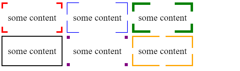
You can also have a complex coloration if you combine this with mask:
.box {
  --b:5px;   /* thickness of the border */
  --c:red;   /* color of the border */
  --w:20px;  /* width of border */


  padding:var(--b); /* space for the border */

  position:relative;
  /*Irrelevant code*/
  width:200px;
  height:100px;
  box-sizing:border-box;
  margin:5px;
  display:inline-flex;
  font-size:30px;
  justify-content:center;
  align-items:center;
  line-height:90px;
}
.box::before {
  content:"";
  position:absolute;
  top:0;
  left:0;
  right:0;
  bottom:0;
  background:var(--c,red);
  --g:#0000 90deg,#000 0;
  -webkit-mask:
    conic-gradient(from 90deg  at top    var(--b) left  var(--b),var(--g)) 0    0,
    conic-gradient(from 180deg at top    var(--b) right var(--b),var(--g)) 100% 0,
    conic-gradient(from 0deg   at bottom var(--b) left  var(--b),var(--g)) 0    100%,
    conic-gradient(from -90deg at bottom var(--b) right var(--b),var(--g)) 100% 100%;
  -webkit-mask-size:var(--w) var(--w);
  background-origin:border-box;
  -webkit-mask-repeat:no-repeat;
  mask:
    conic-gradient(from 90deg  at top    var(--b) left  var(--b),var(--g)) 0    0,
    conic-gradient(from 180deg at top    var(--b) right var(--b),var(--g)) 100% 0,
    conic-gradient(from 0deg   at bottom var(--b) left  var(--b),var(--g)) 0    100%,
    conic-gradient(from -90deg at bottom var(--b) right var(--b),var(--g)) 100% 100%;
  mask-size:var(--w) var(--w);
  mask-repeat:no-repeat;
}
<div class="box">
some content
</div>
<div class="box" style="--c:repeating-linear-gradient(45deg,red,blue);--w:40px;--b:2px">
some content
</div>
<div class="box" style="--c:repeating-linear-gradient(90deg,#000 0 5px,transparent 5px 10px);--w:30%;--b:8px">
some content
</div>
<div class="box" style="--c:conic-gradient(red,green,yellow);--w:50%;--b:3px">
some content
</div>
<div class="box" style="--c:purple;--w:10px;--b:10px">
some content
</div>
<div class="box" style="--c:repeating-linear-gradient(45deg,orange 0 5px,blue 5px 10px);--w:calc(50% - 10px);--b:4px">
some content
</div>
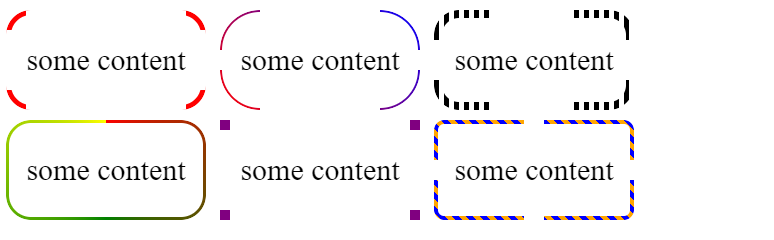
And why not with radius:
.box {
  --b:5px;   /* thickness of the border */
  --c:red;   /* color of the border */
  --w:20px;  /* width of border */
  --r:25px;  /* radius */


  padding:var(--b); /* space for the border */

  position:relative;
  /*Irrelevant code*/
  width:200px;
  height:100px;
  box-sizing:border-box;
  margin:5px;
  display:inline-flex;
  font-size:30px;
  justify-content:center;
  align-items:center;
  line-height:90px;
}
.box::before {
  content:"";
  position:absolute;
  top:0;
  left:0;
  right:0;
  bottom:0;
  background:var(--c,red);
  padding:var(--b);
  border-radius:var(--r);
  -webkit-mask:
    linear-gradient(#fff 0 0) top   /calc(100% - 2*var(--w)) var(--b),
    linear-gradient(#fff 0 0) bottom/calc(100% - 2*var(--w)) var(--b),
    linear-gradient(#fff 0 0) left  /var(--b) calc(100% - 2*var(--w)),
    linear-gradient(#fff 0 0) right / var(--b) calc(100% - 2*var(--w)),
    linear-gradient(#fff 0 0) content-box,
    linear-gradient(#fff 0 0);
  -webkit-mask-composite:destination-out;
  -webkit-mask-repeat:no-repeat;
  mask:
    linear-gradient(#fff 0 0) top   /calc(100% - 2*var(--w)) var(--b),
    linear-gradient(#fff 0 0) bottom/calc(100% - 2*var(--w)) var(--b),
    linear-gradient(#fff 0 0) left  /var(--b) calc(100% - 2*var(--w)),
    linear-gradient(#fff 0 0) right / var(--b) calc(100% - 2*var(--w)),
    linear-gradient(#fff 0 0) content-box,
    linear-gradient(#fff 0 0);
  mask-composite:exclude;
  mask-repeat:no-repeat;
}
<div class="box">
some content
</div>
<div class="box" style="--c:repeating-linear-gradient(45deg,red,blue);--w:40px;--b:2px;--r:40px;">
some content
</div>
<div class="box" style="--c:repeating-linear-gradient(90deg,#000 0 5px,transparent 5px 10px);--w:30%;--b:8px">
some content
</div>
<div class="box" style="--c:conic-gradient(red,green,yellow);--w:50%;--b:3px">
some content
</div>
<div class="box" style="--c:purple;--w:10px;--b:10px;--r:0px">
some content
</div>
<div class="box" style="--c:repeating-linear-gradient(45deg,orange 0 5px,blue 5px 10px);--w:calc(50% - 10px);--b:4px;--r:10px">
some content
</div>