How do I set a background-color for the width of text, not the width of the entire element, using CSS?
Solution 1:
Put the text in an inline element, such as a <span>.
<h1><span>The Last Will and Testament of Eric Jones</span></h1>
And then apply the background color on the inline element.
h1 {
    text-align: center;
}
h1 span {
    background-color: green;
}
An inline element is as big as its contents is, so that should do it for you.
Solution 2:
Option 1
display: table;
- no parent required
h1 {
    display: table; /* keep the background color wrapped tight */
    margin: 0px auto 0px auto; /* keep the table centered */
    padding:5px;font-size:20px;background-color:green;color:#ffffff;
}
<h1>The Last Will and Testament of Eric Jones</h1>fiddle
http://jsfiddle.net/J7VBV/293/
more
display: table tells the element to behave as a normal HTML table would.
More about it at w3schools, CSS Tricks and here
Option 2
display: inline-flex;
- requires
text-align: center;on parent
.container {
    text-align: center; /* center the child */
}
h1 {
    display: inline-flex; /* keep the background color wrapped tight */
    padding:5px;font-size:20px;background-color:green;color:#ffffff;
}
<div class="container">
<h1>The Last Will and Testament of Eric Jones</h1>
</div>Option 3
display: flex;
- requires a flex parent container
.container {
  display: flex;
  justify-content: center; /* center the child */
}
h1 {
    display: flex;
    /* margin: 0 auto; or use auto left/right margin instead of justify-content center */
    padding:5px;font-size:20px;background-color:green;color:#ffffff;
}
<div class="container">
<h1>The Last Will and Testament of Eric Jones</h1>
</div>about
Probably the most popular guide to Flexbox and one I reference constantly is at CSS Tricks
Option 4
display: block;
- requires a flex parent container
.container {
  display: flex;
  justify-content: center; /* centers child */
}
h1 {
    display: block;
    padding:5px;font-size:20px;background-color:green;color:#ffffff;
}
<div class="container">
<h1>The Last Will and Testament of Eric Jones</h1>
</div>Option 5
::before
- requires entering words in css file (not very practical)
h1 {
    display: flex; /* set a flex box */
    justify-content: center; /* so you can center the content like this */
}

h1::before {
    content:'The Last Will and Testament of Eric Jones'; /* the content */
    padding: 5px;font-size: 20px;background-color: green;color: #ffffff;
}<h1></h1>fiddle
http://jsfiddle.net/J7VBV/457/
about
More about css pseudo elements ::before and ::after at CSS Tricks and pseudo elements in general at w3schools
Option 6
display: inline-block;
centering with
position: absoluteandtranslateXrequires a
position: relativeparent
.container {
  position: relative; /* required for absolute positioned child */
}
h1 {
  display: inline-block; /* keeps container wrapped tight to content */
  position: absolute; /* to absolutely position element */
  top: 0;
  left: 50%; /* part1 of centering with translateX/Y */
  transform: translateX(-50%); /* part2 of centering with translateX/Y */
  white-space: nowrap; /* text lines will collapse without this */
  padding:5px;font-size:20px;background-color:green;color:#ffffff;
}
<h1>The Last Will and Testament of Eric Jones</h1>about
More on centering with transform: translate(); (and centering in general) in this CSS tricks article
Option 7
text-shadow: and box-shadow:
- not what the OP was looking for but maybe helpful to others finding their way here.
h1, h2, h3, h4, h5 {display: table;margin: 10px auto;padding: 5px;font-size: 20px;color: #ffffff;overflow:hidden;}
h1 {
    text-shadow: 0 0 5px green,0 0 5px green,
                 0 0 5px green,0 0 5px green,
                 0 0 5px green,0 0 5px green,
                 0 0 5px green,0 0 5px green;
}
h2 {
    text-shadow: -5px -5px 5px green,-5px 5px 5px green,
                  5px -5px 5px green,5px 5px 5px green;
}
h3 {
    color: hsla(0, 0%, 100%, 0.8);
    text-shadow: 0 0 10px hsla(120, 100%, 25%, 0.5),
                 0 0 10px hsla(120, 100%, 25%, 0.5),
                 0 0 10px hsla(120, 100%, 25%, 0.5),
                 0 0 5px hsla(120, 100%, 25%, 1),
                 0 0 5px hsla(120, 100%, 25%, 1),
                 0 0 5px hsla(120, 100%, 25%, 1);
}
h4 { /* overflow:hidden is the key to this one */
    text-shadow: 0px 0px 35px green,0px 0px 35px green,
                 0px 0px 35px green,0px 0px 35px green;
}
h5 { /* set the spread value to something larger than you'll need to use as I don't believe percentage values are accepted */
  box-shadow: inset 0px 0px 0px 1000px green;
}
<h1>The First Will and Testament of Eric Jones</h1>
<h2>The 2nd Will and Testament of Eric Jones</h2>
<h3>The 3rd Will and Testament of Eric Jones</h3>
<h4>The Last Will and Testament of Eric Jones</h4>
<h5>The Last Box and Shadow of Eric Jones</h5>fiddle
https://jsfiddle.net/Hastig/t8L9Ly8o/
More Options
There are a few other ways to go about this by combining the different display options and centering methods above.
Solution 3:
A little late to game but thought I would add my 2 cents...
To avoid adding the extra mark-up of an inner span you could change the <h1> display property from block to inline (catch is you would have ensure the elements after the <h1> are block elements.
HTML
<h1>
The Last Will and Testament of
Eric Jones</h1>
<p>Some other text</p>
CSS
h1{
    display:inline;
    background-color:green;
    color:#fff;
}
Result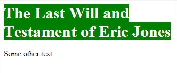
JSFIDDLE
http://jsfiddle.net/J7VBV/
Solution 4:
As the other answers note, you can add a background-color to a <span> around your text to get this to work.
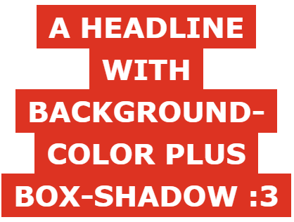
In the case where you have line-height though, you will see gaps. To fix this you can add a box-shadow with a little bit of grow to your span. You will also want box-decoration-break: clone; for FireFox to render it properly.
EDIT: If you're getting issues in IE11 with the box-shadow, try adding an outline: 1px solid [color]; as well for IE only.
Here's what it looks like in action:
.container {
  margin: 0 auto;
  width: 400px;
  padding: 10px;
  border: 1px solid black;
}

h2 {
  margin: 0;
  padding: 0;
  font-family: Verdana, sans-serif;
  text-transform: uppercase;
  line-height: 1.5;
  text-align: center;
  font-size: 40px;
}

h2 > span {
  background-color: #D32;
  color: #FFF;
  box-shadow: -10px 0px 0 7px #D32,
    10px 0px 0 7px #D32,
    0 0 0 7px #D32;
  box-decoration-break: clone;
}
<div class="container">
<h2><span>A HEADLINE WITH BACKGROUND-COLOR PLUS BOX-SHADOW :3</span></h2>
</div>Solution 5:
A very simple trick to do so, is to add a <span> tag and add background color to that. It will look just the way you want it.
<h1>
    <span>The Last Will and Testament of Eric Jones</span>
</h1>
And CSS
h1 { text-align: center; }
h1 span { background-color: green; }
WHY?
<span> tag in an inline element tag, so it will only span over the content faking the effect.