Hiding elements in responsive layout?
New visible classes added to Bootstrap
Extra small devices
Phones (<768px) (Class names : .visible-xs-block, hidden-xs)
Small devices
Tablets (≥768px) (Class names : .visible-sm-block, hidden-sm)
Medium devices
Desktops (≥992px) (Class names : .visible-md-block, hidden-md)
Large devices
Desktops (≥1200px) (Class names : .visible-lg-block, hidden-lg)
For more information : http://getbootstrap.com/css/#responsive-utilities
Below is deprecated as of v3.2.0
Extra small devices
Phones (<768px) (Class names : .visible-xs, hidden-xs)
Small devices
Tablets (≥768px) (Class names : .visible-sm, hidden-sm)
Medium devices
Desktops (≥992px) (Class names : .visible-md, hidden-md)
Large devices
Desktops (≥1200px) (Class names : .visible-lg, hidden-lg)
Much older Bootstrap
.hidden-phone, .hidden-tablet etc. are unsupported/obsolete.
UPDATE:
In Bootstrap 4 there are 2 types of classes:
- The
hidden-*-upwhich hide the element when the viewport is at the given breakpoint or wider. -
hidden-*-downwhich hide the element when the viewport is at the given breakpoint or smaller.
Also, the new xl viewport is added for devices that are more then 1200px width. For more information click here.
Bootstrap 4 Beta Answer:
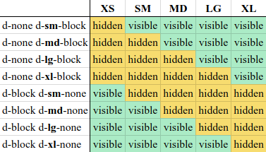
d-block d-md-noneto hide on medium, large and extra large devices.
d-none d-md-blockto hide on small and extra-small devices.
Note that you can also inline by replacing d-*-block with d-*-inline-block
Old answer: Bootstrap 4 Alpha
-
You can use the classes
.hidden-*-upto hide on a given size and larger devices.hidden-md-upto hide on medium, large and extra large devices. -
The same goes with
.hidden-*-downto hide on a given size and smaller devices.hidden-md-downto hide on medium, small and extra-small devices visible-* is no longer an option with bootstrap 4
-
To display only on medium devices, you can combine the two:
hidden-sm-downandhidden-xl-up
The valid sizes are:
-
xsfor phones in portrait mode (<34em) -
smfor phones in landscape mode (≥34em) -
mdfor tablets (≥48em) -
lgfor desktops (≥62em) -
xlfor desktops (≥75em)
This was as of Bootstrap 4, alpha 5 (January 2017). More details here: http://v4-alpha.getbootstrap.com/layout/responsive-utilities/
On Bootstrap 4.3.x: https://getbootstrap.com/docs/4.3/utilities/display/
Bootstrap 4.x answer
hidden-* classes are removed from Bootstrap 4 beta onward.
If you want to show on medium and up use the d-* classes, e.g.:
<div class="d-none d-md-block">This will show in medium and up</div>
If you want to show only in small and below use this:
<div class="d-block d-md-none"> This will show only in below medium form factors</div>
Screen size and class chart
| Screen Size        | Class                          |
|--------------------|--------------------------------|
| Hidden on all      | .d-none                        |
| Hidden only on xs  | .d-none .d-sm-block            |
| Hidden only on sm  | .d-sm-none .d-md-block         |
| Hidden only on md  | .d-md-none .d-lg-block         |
| Hidden only on lg  | .d-lg-none .d-xl-block         |
| Hidden only on xl  | .d-xl-none                     |
| Visible on all     | .d-block                       |
| Visible only on xs | .d-block .d-sm-none            |
| Visible only on sm | .d-none .d-sm-block .d-md-none |
| Visible only on md | .d-none .d-md-block .d-lg-none |
| Visible only on lg | .d-none .d-lg-block .d-xl-none |
| Visible only on xl | .d-none .d-xl-block            |
Rather than using explicit
.visible-*classes, you make an element visible by simply not hiding it at that screen size. You can combine one.d-*-noneclass with one.d-*-blockclass to show an element only on a given interval of screen sizes (e.g..d-none.d-md-block.d-xl-noneshows the element only on medium and large devices).
Documentation