How can I fill a div with an image while keeping it proportional?
I found this thread — How do you stretch an image to fill a <div> while keeping the image's aspect-ratio? — that is not entirely the thing that I want.
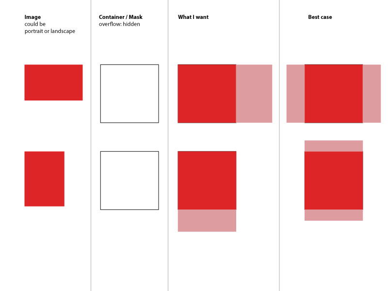
I have a div with a certain size and an image inside of it. I want to always fill-out the div with the image regardless if the image is landscape or portrait. And it doesn't matter if the image is cut-off (the div itself has overflow hidden).
So if the image is portrait I want the width to be 100% and the height:auto so it stays in proportion. If the image is landscape I want the height to be 100% and the width to beauto`. Sounds complicated right?
<div class="container">
   <img src="some-image.jpg" alt="Could be portrait or landscape"/>
</div>
Since I don't know how to do it I simply created a quick image of what I mean. I can't even properly describe it.
So, I guess I'm not the first one asking this. However I couldn't really find a solution to this. Maybe there is some new CSS3 way of doing this - I'm thinking of flex-box. Any idea? Maybe it's even easier than I expect it to be?
Solution 1:
If I correctly understand what you want, you may leave the width and height attributes off the image to maintain aspect ratio and use flexbox to do the centering for you.
.fill {
    display: flex;
    justify-content: center;
    align-items: center;
    overflow: hidden
}
.fill img {
    flex-shrink: 0;
    min-width: 100%;
    min-height: 100%
}
<div class="fill">
<img src="https://picsum.photos/id/237/320/240" alt="" />
</div>JSFiddle here
I tested this successfully in IE9, Chrome 31, and Opera 18. But no other browsers were tested. As always you must consider your particular support requirements.
Solution 2:
It's a bit late but I just had the same problem and finally solved it with the help of another stackoverflow post (https://stackoverflow.com/a/29103071).
img {
   object-fit: cover;
   width: 50px;
   height: 100px;
}
Hope this still helps somebody.
Ps: Also works together with max-height, max-width, min-width and min-height css properties. It's espacially handy with using lenght units like 100% or 100vh/100vw to fill the container or the whole browser window.
Solution 3:
All answers below have fixed width and height, which makes solution "not responsive".
To achieve the result but keep image responsive I used following:
- Inside container place a transparent gif image with desired proportion
- Give an image tag inline css background with image you want to resize and crop
HTML:
<div class="container">
<img style="background-image: url("https://i.imgur.com/XOmNCwY.jpg");" src="img/blank.gif">
</div>
.container img{
width: 100%;
height: auto;
background-size: cover;
background-repeat: no-repeat;
background-position: center;
}