Tooltips for mobile browsers
I currently set the title attribute of some HTML if I want to provide more information:
<p>An <span class="more_info" title="also called an underscore">underline</span> character is used here</p>
Then in CSS:
.more_info {
  border-bottom: 1px dotted;
}
Works very nice, visual indicator to move the mouse over and then a little popup with more information. But on mobile browsers, I don't get that tooltip. title attributes don't seem to have an effect. What's the proper way to give more information on a piece of text in a mobile browser? Same as above but use Javascript to listen for a click and then display a tooltip-looking dialog? Is there any native mechanism?
You can fake the title tooltip behavior with Javascript. When you click/tab on an element with a title attribute, a child element with the title text will be appended. Click again and it gets removed.
Javascript (done with jQuery):
$("span[title]").click(function () {
var $title = $(this).find(".title");
if (!$title.length) {
$(this).append('<span class="title">' + $(this).attr("title") + '</span>');
} else {
$title.remove();
}
});
CSS:
.more_info {
  border-bottom: 1px dotted;
  position: relative;
}

.more_info .title {
  position: absolute;
  top: 20px;
  background: silver;
  padding: 4px;
  left: 0;
  white-space: nowrap;
}
Demo: http://jsfiddle.net/xaAN3/
Here is a CSS only solution. (Similar to @Jamie Pate 's answer, but without the JavaScript.)
We can use the pseudo class :hover, but I'm not sure all mobile browsers apply these styles when the element is tapped. I'm using pseudo class :focus because I'm guessing it's safer. However, when using pseudo class :focus we need to add tabindex="0" to elements that don't have a focus state intrinsically.
I'm using 2 @media queries to ensure all mobile devices are targeted. The (pointer: coarse) query will target any device that the primary input method is something "coarse", like a finger. And the (hover: none) query will target any device that the primary pointing system can't hover.
This snippet is all that's needed:
@media (pointer: coarse), (hover: none) {
      [title] {
        position: relative;
        display: inline-flex;
        justify-content: center;
      }
      [title]:focus::after {
        content: attr(title);
        position: absolute;
        top: 90%;
        color: #000;
        background-color: #fff;
        border: 1px solid;
        width: fit-content;
        padding: 3px;
      }
    }
/*Semantic Styling*/
body {
  display: grid;
  place-items: center;
  text-align: center;
  height: 100vh;
}

a {
  height: 40px;
  width: 200px;
  background: #fa4766;
  color: #fff;
  text-decoration: none;
  padding: 10px;
  box-sizing: border-box;
  border-radius: 10px;
}

/*Functional Styling*/
@media (pointer: coarse), (hover: none) {
  [title] {
    position: relative;
    display: flex;
    justify-content: center;
  }
  [title]:focus::after {
    content: attr(title);
    position: absolute;
    top: 90%;
    color: #000;
    background-color: #fff;
    border: 1px solid;
    width: fit-content;
    padding: 3px;
  }

}
<a title="this is the Title text" tabindex="0">Tag with Title</a>Obviously, you'll need to open this on a mobile device to test it. Here is a Pen with the same code.
Slightly more elaborated version of flavaflo's answer:
- Uses pre-defined div as pop-up that can hold HTML, rather than reading from a title attribute
- Opens/closes on rollover if mouse is used
- Opens on click (touch screen) and closes on click on the open pop-up or anywhere else on the document.
HTML:
<span class="more_info">Main Text<div class="popup">Pop-up text can use <b>HTML</b><div></span>
CSS:
.more_info {
    border-bottom: 1px dotted #000;
  position: relative;
    cursor: pointer;
}

.more_info .popup {
    position: absolute;
    top: 15px; /*must overlap parent element otherwise pop-up doesn't stay open when rolloing over '*/
    background: #fff;
    border: 1px solid #ccc;
    padding: 8px;
    left: 0;
    max-width: 240px;
    min-width: 180px;
    z-index: 100;
    display: none;
}
JavaScript / jQuery:
$(document).ready(function () {

    //init pop-ups
    $(".popup").attr("data-close", false);

    //click on pop-up opener
    //pop-up is expected to be a child of opener
    $(".more_info").click(function () {
        var $title = $(this).find(".popup");
        //open if not marked for closing
        if ($title.attr("data-close") === "false") {
            $title.show();
        }
        //reset popup
        $title.attr("data-close", false);
    });

    //mark pop-up for closing if clicked on
    //close is initiated by document.mouseup,
    //marker will stop opener from re-opening it
    $(".popup").click(function () {
        $(this).attr("data-close",true);
    });

    //hide all pop-ups
    $(document).mouseup(function () {
        $(".popup").hide();

    });

    //show on rollover if mouse is used
    $(".more_info").mouseenter(function () {
        var $title = $(this).find(".popup");
        $title.show();
    });

    //hide on roll-out
    $(".more_info").mouseleave(function () {
        var $title = $(this).find(".popup");
        $title.hide();
    });

});
Demo here https://jsfiddle.net/bgxC/yvs1awzk/
Given that a lot of people nowadays (2015) use mobile browsers, and title still hasn't found a form of exposure in mobile browsers, maybe it's time to deprecate reliance upon title for meaningful information.
It should never be used for critical information, but it is now becoming dubious for useful information, because if that information is useful and cannot be shown to half the users, then another way of showing it to almost all users needs to be found.
For static pages, perhaps some visible text near to the relevant control, even as fine print. For server-generated pages, browser sniffing could provide that only for mobile browsers. On the client side, javascript could be used to trap the focus event, via bubbling, to show the extra text next to the currently focussed element. That would minimise the screen space taken up, but would not necessarily be of much use, since, in a lot of instances, bringing focus to a control can only be done in a way that immediately activates its action, bypassing the ability to find out about it before using it!
Over all though, it appears that the difficulties of showing the title attribute on mobile devices, may lead to its demise, mostly due to needing an alternative that is more universal. That is a pity, because mobiles could use a way to show such extra info on-demand, without taking up the limited screen space.
It seems strange that the w3c and mobile browser makers did not do anything about this issue a long time ago. At least they could have displayed the title text on top of the menu that appears when a long press on a control is made.
Personally, I wish it was placed at the top of a right-click/long-touch menu, as it won't timeout, and would be available on all browsers.
The other alternative is to construct footnotes, so an [n] type superscript is put next to the element/text needing more info, linking to explanatory text in a list at the bottom of the page. Each of those can have a similar [n] type link back to the original text/element. That way, it keeps the display uncluttered, but provides easy bidirectional swapping in a simple way. Sometimes, old print media ways, with a little hyperlink help, are best.
The title attribute has been hijacked by some browsers to provide help text for the pattern attribute, in that its text pops up if the pattern doesn't match the text in the input element. Typically, it is to provide examples of the right format.
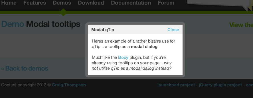
Depending on how much information you want to give the user, a modal dialogue box might be an elegant solution.
Specifically, you could try the qTip jQuery plugin, which has a modal mode fired on $.click():