Bootstrap Carousel image doesn't align properly
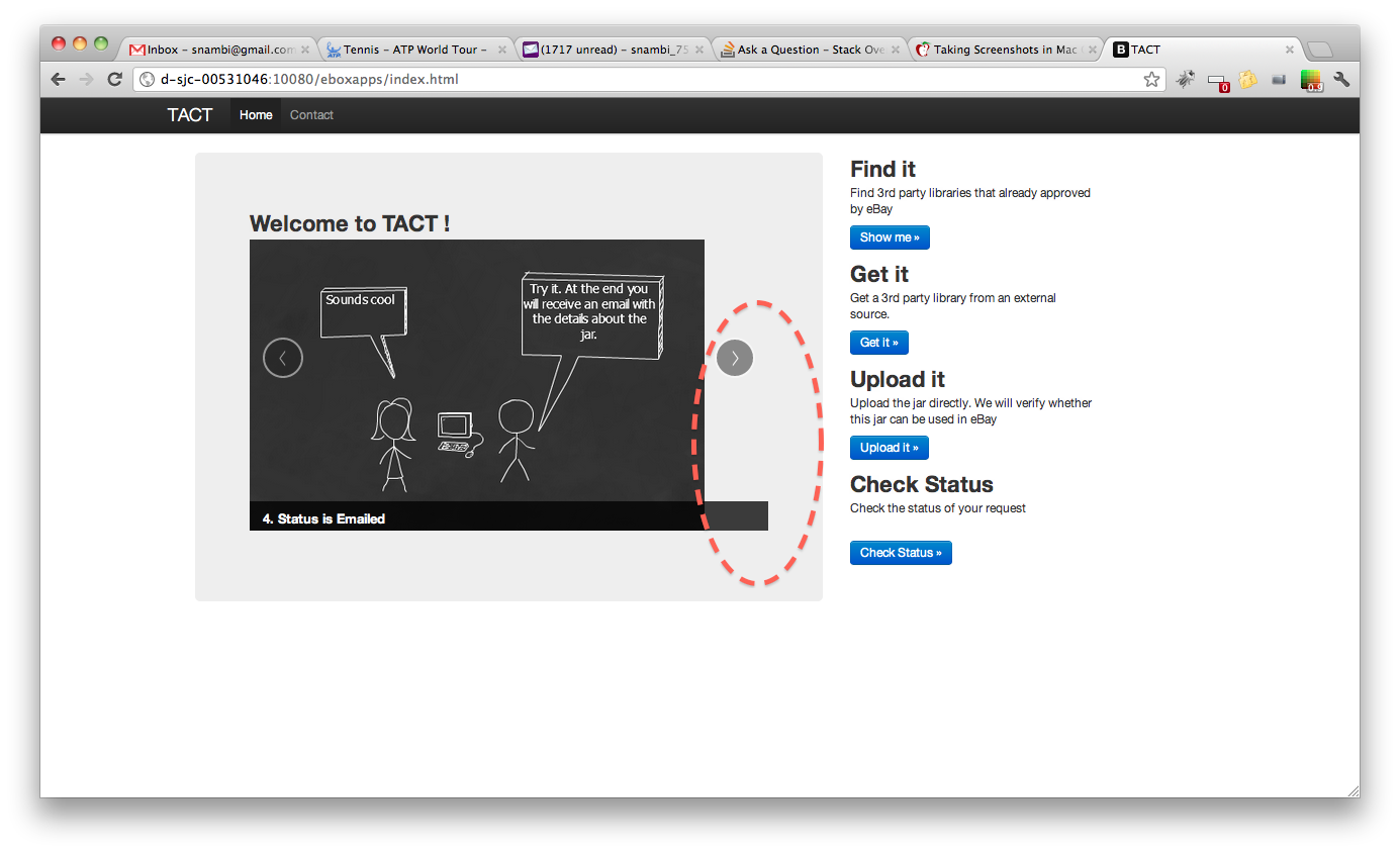
Please take a look at the following image, we are using bootstrap carousel to rotate the images. However, when the window width is large, the image doesn't align with the border properly.
But the carousel example provided by bootstrap always works fine, no matter the width of the window. Following the code.
Can someone explain why carousel is behaving differently? Is this anything to do with Image size or some bootstrap config is missing?
<section id="carousel">
<div class="hero-unit span6 columns">
<h2>Welcome to TACT !</h2>
<div id="myCarousel" class="carousel slide" >
<!-- Carousel items -->
<div class="carousel-inner">
<div class="item active" >
<img alt="" src="/eboxapps/img/3pp-1.png">
<div class="carousel-caption">
<h4>1. Need a 3rd party jar?</h4>
</div>
</div>
<div class="item">
<img alt="" src="/eboxapps/img/3pp-2.png">
<div class="carousel-caption">
<h4>2. Create Request</h4>
</div>
</div>
<div class="item">
<img alt="" src="/eboxapps/img/3pp-3.png">
<div class="carousel-caption">
<h4>3. What happens?</h4>
</div>
</div>
<div class="item">
<img alt="" src="/eboxapps/img/3pp-4.png">
<div class="carousel-caption">
<h4>4. Status is Emailed</h4>
</div>
</div>
</div>
<!-- Carousel nav -->
<a class="carousel-control left" href="#myCarousel" data-slide="prev">‹</a>
<a class="carousel-control right" href="#myCarousel" data-slide="next">›</a>
</div>
</div>
The solution is to put this CSS code into your custom CSS file:
.carousel-inner > .item > img {
  margin: 0 auto;
}
With bootstrap 3, just add the responsive and center classes:
<img class="img-responsive center-block" src="img/....jpg" alt="First slide">
This automatically does image resizing, and centers the picture.
Edit:
With bootstrap 4, just add the img-fluid class
<img class="img-fluid" src="img/....jpg">